Wednesday, November 21, 2007

Assignment 5: Notebook Design.


In this assignment, we're supposed to design the exterior and the interior of a laptop, in line with the HP & MTV Global Design Competition.


The theme that I've chosen is PEACE.
This was a timely theme because of the recent situation in Myanmar, and the prolonged-until-forever war in Iraq.


Exterior:
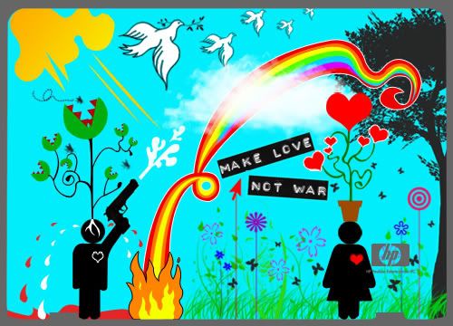
Photo Sharing and Video Hosting at Photobucket


Interior:
Photo Sharing and Video Hosting at Photobucket


The main idea of this design is to portray the stark difference between people who war (as represented by a man), and people who love (as represented by a girl). It does seem sexist to do such distinction, but categorizing men as people who war is not my intention. It is just that the concept of war and fighting and dominating is more associated with male figures, and if I have to choose between a male and a female, I would more likely associate the male with war, and the female with love. I repeat, this is not a sexist act.


As you can see from the design, people who war experience bloodshed, and these blood shed are mixed with tears. They fuse together into a puddle. The presence of a gun represents weapons and killing. People who love are associated with nature, with doves which symbolizes peace, and with a rainbow which is colorful and full of life.


Contrasting war and love:
war(i): a Venus Flytrap with roots in-grown into the man's head, suggesting the man is under someone or something else's control.
love(i): a potted plant of hearts. Hearts symbolize love, and the plant being potted symbolizes civilization.

war(ii): a black heart.
love(ii): a red heart.

war(iii): flooded with blood and tears.
love(iii): a land of greenery. Because peace is associated with nature, and flourishing plants, whereas war is associated with destruction and bloodshed.


Lastly, "Make Love Not War" is a slogan I've chosen for this theme. It is concise and clear in its message of peace.


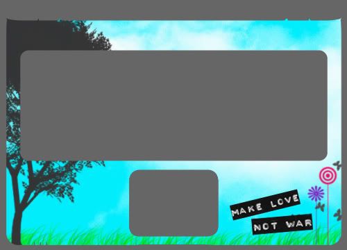
The design of the exterior has MANY details, and seems to lack a focus. My reasoning for this is that a laptop design is different from a poster design. A poster should capture the audience's attention immediately, and direct them through a reading path. However, a laptop does not need to capture the user's attention immediately. A laptop is a daily necessity, and the user will face it everyday. The bigger challenge i feel would then be "How to retain the user's interest and not let him/her get bored with the design?"

So my solution for this challenge would be to make the exterior of the laptop a blast of bright colors and exquisite details.


The interior is consistent with the exterior in the color scheme, and the repetition of the clouds, the grass, the tree, the plants, and the slogan "Make Love Not War" which reiterates the theme of peace in a clear and concise way.


That's all. I guess I can go on and on forever about this design. Well, I love it, and I hope you do. :)

Monday, October 15, 2007

Assignment 4: Save this/that--Poster design.


In this assignment, we're supposed to design a poster that conveys a message according to the theme that we've chosen. The theme I've chosen is: Boycott KFC.


the KFC logo i referenced from.


referenced also from kfccruelty.com


The poster I came up with:

Inspired by "WANTED" posters.


ONE: The usual friendly and amiable Colonel is edited into a nasty evil person, as represented by the horns, and an evil grin.
TWO: There is a color association between the KFC logo and the devil's horns, associating KFC with the devil.
THREE: I wanted to achieve the "old and tattered" feeling. This is done by using a gray background, and adding a yellow tint.
FOUR: The spotlight highlights the Colonel as the prime suspect and the one responsible for everything.
FIVE: The fonts chosen gives a similar "old" feel to the poster. Also, it brings in a cowboy feel, which is in line with the idea of a "WANTED" poster, since we always see "WANTED" posters in cowboy shows.
SIX: "Nobody does chicken like KFC" is a KFC slogan. And it is being incorporated into this poster against KFC, posing a irony and a pun.


That's all! :)
Assignment 3: U C what I C.

I did something for this assignment but wasn't satisfied with the results. So, i'm going to re-do it. Look out for updates. =)

Tuesday, October 2, 2007

in-class exercise.


We were supposed to draw something that happened around us. "To freeze time", and from the example shown in class, I suppose there should be a sort of ambiguity involved.


I couldn't find inspiration in class, so I walked around school. And I saw this guy looking over the balcony. For a moment I thought he was going to commit suicide or something. I walked nearer and realised he was holding a camera and was simply taking photos of the scenery.


So hence gave me inspiration for the in-class exercise.
And I miss drawing alot, and so took this opportunity to draw too.


It's a simple obedience to the rule-of-thirds.


Nothing very complicated or deep. Although the sense of uncertainty still remains, the feeling it gives is more peaceful than troubled. I guess it reflects my feelings at that point of time as whille--wanting a moment of peace.


Comments?

Monday, October 1, 2007

Random.


I love taking photos. To "freeze time" in the words of Julian. But I'm still such a noob when it comes to photography and photoshopping. For one, I've yet to learn how to use an slr. So for now I have to make do with my limited k800i, which is not even a proper digital camera!


Okay, enough ranting. Here are some pictures I've taken, and edited. Really hope to learn more and improve on my phototaking and editing skills. Please leave me comments on how I can improve. And if there's anything I've done to my photos that you wanna ask me about, feel free to do so okay? Yunno, learn from one another. "Care and share", by sharity elephant.


(This was one of my first edits ever.)


Deliberately infringed the principle of balance. Makes the whole picture heavier on the right side. Somehow, I prefer it this way. Don't like to be bonded by principles.


Loves comments. Criticise me like nobody's business and tell me what you think honestly. Woot.

Tuesday, September 18, 2007

Assignment 2.


For this assignment, we're supposed to perform at least five levels of abstractions on an object, and to derive at the "ultimate simplicity, the reduction of visual detail to the irreducible minimum. A symbol, in order to be effective, must not only be seen and recognized but also remembered and even reproduced."


The object I chose is the camera.
I admit my inconscientiousness when I fail to trace every single detail out using the pen tool. But I really don't see the point of doing it. It's tedious, and I'll abstract those details out anyway. So, here's my abstractions.


Level I: the original image.


Level II: Losing colours.


Level III: Losing words + some details.


Level IV: Losing more details.


Level V: the symbol.


Level VI: Losing its specificity.


Okay, so that's all for assignment two, a relatively simple assignment as compared to the others. Also, the object I've chosen, the camera, is a simple object to abstract. So, yupps. =)


Take a deep breath, and brace myself for the next assignment.

Monday, September 10, 2007

Assignment 1: Part III--The Final Product.


As of the last post, I have chosen four thumbnails to develop further. In this final post, I will further develop two of the designs, and attempt to bring it to life by adding colours.


From the Music. category, I've chosen to combine some of the elements in both thumbnails, and apply some suggestions give by the class.


This is an improved hand-drawn draft.

ONE. I've included the inverted treble cleft, and the dot for the "i" from the first thumbnail, and incorporated them into the concept of the second thumbnail.
TWO. I've adopted the suggestions of using the black keys of the piano for the "E".


And now, the next step is to add colours.
I had quite a hard time thinking about the colour scheme. It should be bright and cheery, so as to show that i LOVE music. Yet I've always been conceptualising it as a black and white image.


And then one idea came to me, which is to use bright neon-like colours and spotlights to give a "funky jazz bar" or "pop concert" kind of feeling.

So, here is my final product.

The font I chose gives a strong-headed feeling, with a punkish touch.


Next being the Migraine. category.

Here is an improved final draft.

ONE. I've applied the suggestion to include lightnings, to create a greater sense of pain.
TWO. Also, to make that pain more ingrained, I've added some cracks. Ouch.


Colours!!

Colours for this is comparatively easier to come up with.
ONE. Black for a sense of darkness, and is provides contrast for the brain.
TWO. Yellow for lightnings, and red to represent tension and pain.
THREE. The font that I chose is of a slight zigzag, giving a further sense of unstability. It looks handwritten for sincerity and truthfulness.


Having done this final part of the assignment, I realise the importance of colours, and how colours really bring plain sketches to life. Every colour bring along with it its own connotations, and we need to learn how to make use of these colours.


As usual, pls do leave comments. =D

Wednesday, September 5, 2007

Assignment 1: Part II--Developing drafts


As in the last post, I came up with eight thumbnails to work with and I've chosen four of which I will develop further.

Here are the four drafts I've developed.


Music.

draft 1:

This was developed from the first thumbnail of music.
One. The thumbnail was too rigid and stiff so I made the musical notes more abstract and flexible.
Two. Also, the treble cleft is inverted, and part of it is made into dotted lines so as to show the "S" more distinctively.
Three. I added a dot on top of the "i", to make it look more like an "i" rather than being part for the "E". In musical terms it represents a sustained note.


Critique: The lines are too thin, hence it doesn't give a defining 3-D look.


draft 2:

This was from the second thumbnail.
Experimented with developing a symbol when I used a saxophone to represent "J".

Referenced from:


Critique: In general, this class preferred this to the first draft. Perhaps because it is more "3-D"...? Also they liked the saxophone. The class was really helpful in helping me think of ideas on how I can represent "E" and "S". One idea that I'll be adopting is using the piano keys to represent "E".


Migraine.

draft 3:

Not much changes to this, save the "I" being replaced by a medicine bottle.

Critique: A cabinet of medicine doesn't really bring out the idea of "migraine". It could be preferring to sickness in general, or simply medicine.


draft 4:

No changes done to this.

Critique: The class was divided as to which draft they prefer. Esther suggested I could add lightnings to create a deeper sense of pain.


Yupps, so that's all for my drafts for now.
Do leave comments, if any. They are greatly appreciated! =)

Monday, September 3, 2007

Assignment 1: Part I--Thumbnails


Me Myself and I
(The title of this assignment is, by strange coincidence, the same as my username.)

In this assignment, we're to come up with two words that best describe us, through fitting them into the sentence "My name is Jessie and I love/hate ________."


For this, I thought of "music", "dance" and "migraine".
Well, of course i don't love migraines.


Here are the eight thumbnails developed.


Music.


Referenced from:


As you can see, this is a rather stiff adaptation of musical notes. And the letters of my name cannot be easily noticed.


Lacking in ideas. But I like the concept of using music bars to form "E".


Dance.


Ballet shoes with ribbons. Rather plain-looking to me.


Inspired by:


Human figures in different dance positions. I like this idea, but it's tough to develop it on paper.


Migraine.


A medicine cabinet, because when migraine strikes, the only way out is to pop pills. Because of that I always make sure I have ample pills at all times. I like this design because it focuses on details. But my name is just spelt out as it is, and not incorporated into the design. Also, there isn't a clear indication of migraine.


This is supposed to be pills arranged in such a way so as to spell out my name. I don't like this, really. It looks like jelly beans or sausages for that matter, and again, it doesn't indicate migraine.


This is made up of different kinds of pills and tablets, and the side view of a person pressing his temples, indicating headache/migraine. It's developed further from the previous thumbnail.


Referenced from:


Lastly, the brain. There are motion lines to indicate tension and throbbing of the brain. I like this design because it is a jump out of the usual pills and medicine idea.


So these are my eight thumbnails at their "purest" undeveloped state.
The next post will show developments on four of these thumbnails, and what the class has to say about them. Stay tuned!


Oh yes! Pleas DO leave comments on how I can improve my designs and if you have any tips for me. Any and every one will be greatly appreciated. =D

Saturday, September 1, 2007

the first post.


i don't know what i should include in this first post.
i suppose i could make do with other people's words then.


An artist creates things to evoke emotion.
Being a designer goes a step further than that,

not only trying to evoke emotion
but trying to make a reaction.

--Mike Davidson--


Stay tuned.