Monday, February 18, 2008

Assignment THREE cont'd: Commend and Defend.


I keep thinking... "Why 'commend'?" Shouldn't it be "comment"? Nevermind me, it's just a random thought.

Anyway, e-learning this week is a very good way of forcing people to comment on your assignment progress, and to have your comments section flooded too. No worries, i love receiving feedbacks.


Here's a compilation of my replies to all the comments posted.
Thanks you all who commented. I really appreciate them a lot. :)


1. Rebecca Oh.
I love the photos that you've taken. I can see the 'love' shown in the pictures.

However, the first picture of the girl making a heart with her hands cant really be seen. The heart was too dark. Maybe you can make the picture a bit brighter? Because when i first looked at the picture, the first thing that came to my mind was ' aww... this girl is so cute'. But the heart wasn't clearly shown.

Ya, I realized that too after photoshopping it. Because I applied ‘curves’ on it, so the hand looks darker.

Before:

After:

Done some brightness/contrast changes. Hope it’s better now.


2. Karen
i agree that the first girl's heart hand sign cannot really be seen.
but i love your photos. the way it was taken, the quality and feeling of them. nicely done!

Thanks!


3. Rash
I think it would be better if your first, second and free hugs photo be in white light since the majority of your photos are in white light. However, I believe that the free hugs photo is taken quite some time back..so a bit hard to retake that moment. Unless you’re gonna take a photo of someone with that poster in the day. Haha Other than that, nice photoshots!

Hmmm, well, it’s really difficult to control the lightings. I’ll try to photoshop the photos to minimize the orangeness of the tungsten lights. And I’ll arrange the sequence of the photos such that the distractions caused by the change in lightings are minimized.


4. Anonymous

Great job! Really love the pics that you have taken. They look nice and the colour is well balanced. The colour combination of your photos gave a warm feeling.In addition, i think your message is clear and straight forward.

Just wondering, what kind of music do you intend to use? Will it be those more towards light heartered kind or more romantic kind?

Actually I haven’t really gone to search for a music piece yet. I guess I’ll be going for a more neutral piece. Not too light-hearted, not too romantic. So it can be funny at times, yet touching at the same time. Not sure how it’ll work out, but hope to find a good piece soon. At most just compose my own song. Haha. Easier said than done!


5. Devi

Hey girl, I like how the pictures turned out. The picture where the older sister reading to the younger brother, I like the way the colours turned out. Not in your face and yet so colourful and pretty. The idea about the different age group doing the love sign is good cos it kind of links the whole video together. All the best

Thanks!


6. jocelyn teo

heyy, ill like to see more photos with the heart formed with fingers!! i think that'll be something that makes your video stand out, because almost everyone else will be taking photos of different representations of love. :) but do try to think out of the box, and make them pose with the heart, in wacky and interesting situations! :)

Yupps, I’ll be getting people whom I know to pose wacky photos for me. Thanks!


7. Mark

Yup nice photoshoots, I liked the free hugs thing haha...loved that video that was floating around...

Anyway I think its nice that you try to explore the way people express and show love, its a nice way to arrange it too. Although I think maybe for each set you might want to try transiting the backgrounds/lightning or keeping it the same.. admittedly, its tough to retake but er, shoot more?

Hmmm, personally I think it’s okay to transit between the different lightings. It depends on the transition style chosen, and I’ll try to keep the distractions minimal. But I doubt I’ll be able to keep a consistent white lighting.


8. Jennifer
I love the idea of taking pictures of random people forming the heartshaped using their hands. haha! u can look for me if you need hands!

Thanks!


9. chr1s0ng

Same comment about the first pic.. Play around with the angle if you can retake the shot perhaps...

Putting it together i can see it working... just the process and what you're using as background will make the difference on the type of effect it has... so experiment abit.. you'll get the mood you want hopefully...

Note taken. Thanks!


10. Katherine Lu

One good way to capture kids doing heart shape is to ... GATECRASH a child care centre!! HAHA. Ok I am kidding but you can write in and ask for permission. I mentioned childcare because the kids are extremely adorable and innocement. Most of the time they are actually not even camera shy especially with their friends and they will have so much fun. In return, you can even offer to email the picture or develope the image for the child care center as to thank them for helping you.

Yes, I'm considering crashing into a childcare centre too. I've been to my church children's service for these children photos. Hope childcare centers are friendly! :)


Once again, thanks all who've commented. :)
Anyone with any other feedbacks, please do drop me a comment!
Assignment THREE: My Valentine.

Procedure:

  • Take as many pictures as possible (with love theme) (e.g. about my love, something good about your boyfriend/girlfriend..i.e. why you idolize her/him, what you wish to have in Valentine day, Valentine spirit or A valentine day in NUS)
  • Choose 40-70 pictures
  • Build a story around the pictures taken
  • Use Microsoft Photo Story, Windows Movie Maker, Premiere or after effects to do the panning, tilting, scaling, and transition etc.
  • Add the title/credit in your movie
  • Add voice/a narration/song/background
  • Requirement: min 2.5-min to max 4-min clip

The idea (Stage I):
(I didn't scan in my stage I, but anyway, here's a description of my idea.)

The theme/main idea i wanna capture is how humans express love to one another.


ONE: It is a human-human interaction. Not with pets or between animals, but purely human-human. I feel that it'll strike a deeper chord within us, humans.

TWO: The way humans express love in this video will be divided into four segments, "kids," "teenage," "adult," and "elderly," just like the different life stages of a human being. So there'll be a "storyline" for the audience to follow, and they'll know what to expect next.

THREE: Inspired by this video, I'm thinking of taking photos of people (from different age groups) forming a heart with their hands. These photos will serve as an introduction to the next segment in the video. So before showing photos of kids expressing love, i'd show some kids doing the heart thing. But it's proven to be a difficult task and I've only managed to get two such photos thus far.


Feedback: It's going to be very tough. To take so many photos of strangers and to capture "that moment."

Yea, i know it's going to be very tough. Especially in such a society where people don't readily express love to one another, and they tend to shy away from cameras.

Once this whole concept came to me, it stuck on in my head and just wouldn't go away. I foresee it's going to be a tough and time-consuming task, but i'm so captivated with the concept that i really want to give it a try.


Stage II:
So in the past one week, I went out and took photos.
And here and some of those I prefer. Four/five of each segment.
Enough talk. Let's look at the photos.


Kids.


the "heart" thing.


spending time together.


playing together.


The older sister is reading to the younger brother.


Teenage.


from my archives. Stranger giving out free hugs along Orchard Road.


Valentine's Special. That's a lot of balloons.


from my archives. Doing stupid things together.
(I'm on the right.)


from my archives. The guys always have their own way of loving one another.


Adults.


Playing catch.


Spending time together.


Awwwww.


Reading to the kids.


Elderly.


Grandparents tend to dote on their grandkids a lot. And they're strangely more expressive with their love to them. And they are so proud of them it's easier to ask them for a photo.


Ditto.


Basking together. A couple i suppose.


Teaching his grandson how to ride a bike.


Old friends sitting under a coconut tree. =X


After taking some photos for stage II, i realize that it's not as difficult as i thought it would be. But i did get some unfriendly stares and sometimes i don't dare to approach the people for a photo. It's all a matter of courage--ask and you'll receive. So, more photo-taking this coming week!

I also learned that it's not that Singaporeans don't express love a lot. It's just that they express love in a different way. By spending time together, playing together, or even just smiling at one another, all these are their expressions of love too.

Having heard and seen all these, do you have any feedback for me?
Come throw me your ideas. I love to hear feedbacks.
:)

Sunday, February 17, 2008

Assignment TWO: Just Another Day.

Design of a simple webpage.
Theme: Create a web based visual narrative of any simple daily/weekend activity/event.


For this assignment, i chose to spend one day at Far East Plaza.

Far East Plaza is unique in that it is a heartland-ish shopping center right smack in the middle of Orchard Road. Many youngsters go there to look for fashionable yet affordable apparels, and at the same time, some middle-aged people and even the elderly can be seen hanging around there. There is a special mix of retro and fashion; of the young and the old.

I wanted to capture this unique characteristic of Far East Plaza, and at the same time present a feel of a slow-paced day. Just randomly walking around this building, taking photos of small, usually unnoticed things.

Because of the assignment requirement, that the whole webpage cannot be bigger than 180kb, i had to look for simple objects, with fewer colors and lesser details. It was quite difficult cuz i am attracted by bright colors and fine details.


Here are the photos.


Welcome. As an introduction.


In his own world.
This boy was seen playing his hand-held game alone on a short ladder while his mum is busy shopping.


Directory.


Top-view of me walking.


The price tag of a tee-shirt.


Pretty chandelier.


Lunch break.


"This shop is for customers only. Non-customers are not allowed to sit here."


Toto? Or is it 4-D? I don't gamble.


Tattoo. There are quite a few tattoo services there.


SALE.


Escalator downwards. As a closure/ending.


Feedback: The class didn't get the second photo until i explained. I guess that photo needs some explanation. One suggestion was the walking photo would be better if the floor was in greater contrast to my shoes. Yea, i can work on that. :)


Tadah. So you've seen my photos.
Any comments?
Pls do feedback ya?
:)

Saturday, February 16, 2008

Assignment ONE: Dreams.


Design an A3 size poster for a play entitled Dreams.

Theme of the play: Surrealistic experimental play about lost opportunities and dreams of a young Singaporean. A story of a person who sacrificed his/her life for someone else's future. Tone of the play is dark comedy.


The idea:
The storyline i came up with is based in old Shanghai. Old Shanghai is "famed" as a sin-city, where prostitution, smuggling of weapons, drugs and alcohol is prevalent. So the story goes that man gets betrayed by his sworn brother for money and smuggled loots.


Some research on old Shanghai.

antique car.


Victorian style lamp posts.


Also thought of what are some items that characterizes old Shanghai.
1. Cigars.
2. Guns.
3. Bloodshed.
4. Smoke.
5. Black suits.
6. Dark alleys.


So i incorporated some of these elements into the poster, such that the reader will be able to relate this poster to old Shanghai immediately.


Feedback: Lacks the surrealistic elements. Cuz the poster is presented in a very real setting.


Hmmm, i'm still thinking about how i should change my poster. Will update more soon, i hope.

Tuesday, February 12, 2008

the second first post.


nm3208 requires us to keep a blog as well...
So i thought "What the heck, just lump everything together lah."


Updates coming soon.
i hope.

Wednesday, November 21, 2007

Assignment 5: Notebook Design.


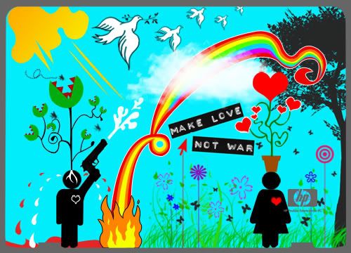
In this assignment, we're supposed to design the exterior and the interior of a laptop, in line with the HP & MTV Global Design Competition.


The theme that I've chosen is PEACE.
This was a timely theme because of the recent situation in Myanmar, and the prolonged-until-forever war in Iraq.


Exterior:
Photo Sharing and Video Hosting at Photobucket


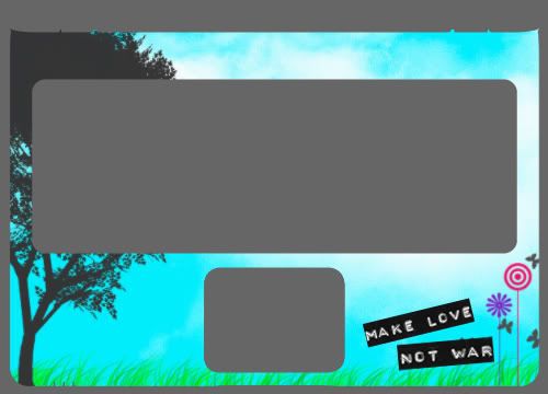
Interior:
Photo Sharing and Video Hosting at Photobucket


The main idea of this design is to portray the stark difference between people who war (as represented by a man), and people who love (as represented by a girl). It does seem sexist to do such distinction, but categorizing men as people who war is not my intention. It is just that the concept of war and fighting and dominating is more associated with male figures, and if I have to choose between a male and a female, I would more likely associate the male with war, and the female with love. I repeat, this is not a sexist act.


As you can see from the design, people who war experience bloodshed, and these blood shed are mixed with tears. They fuse together into a puddle. The presence of a gun represents weapons and killing. People who love are associated with nature, with doves which symbolizes peace, and with a rainbow which is colorful and full of life.


Contrasting war and love:
war(i): a Venus Flytrap with roots in-grown into the man's head, suggesting the man is under someone or something else's control.
love(i): a potted plant of hearts. Hearts symbolize love, and the plant being potted symbolizes civilization.

war(ii): a black heart.
love(ii): a red heart.

war(iii): flooded with blood and tears.
love(iii): a land of greenery. Because peace is associated with nature, and flourishing plants, whereas war is associated with destruction and bloodshed.


Lastly, "Make Love Not War" is a slogan I've chosen for this theme. It is concise and clear in its message of peace.


The design of the exterior has MANY details, and seems to lack a focus. My reasoning for this is that a laptop design is different from a poster design. A poster should capture the audience's attention immediately, and direct them through a reading path. However, a laptop does not need to capture the user's attention immediately. A laptop is a daily necessity, and the user will face it everyday. The bigger challenge i feel would then be "How to retain the user's interest and not let him/her get bored with the design?"

So my solution for this challenge would be to make the exterior of the laptop a blast of bright colors and exquisite details.


The interior is consistent with the exterior in the color scheme, and the repetition of the clouds, the grass, the tree, the plants, and the slogan "Make Love Not War" which reiterates the theme of peace in a clear and concise way.


That's all. I guess I can go on and on forever about this design. Well, I love it, and I hope you do. :)

Monday, October 15, 2007

Assignment 4: Save this/that--Poster design.


In this assignment, we're supposed to design a poster that conveys a message according to the theme that we've chosen. The theme I've chosen is: Boycott KFC.


the KFC logo i referenced from.


referenced also from kfccruelty.com


The poster I came up with:

Inspired by "WANTED" posters.


ONE: The usual friendly and amiable Colonel is edited into a nasty evil person, as represented by the horns, and an evil grin.
TWO: There is a color association between the KFC logo and the devil's horns, associating KFC with the devil.
THREE: I wanted to achieve the "old and tattered" feeling. This is done by using a gray background, and adding a yellow tint.
FOUR: The spotlight highlights the Colonel as the prime suspect and the one responsible for everything.
FIVE: The fonts chosen gives a similar "old" feel to the poster. Also, it brings in a cowboy feel, which is in line with the idea of a "WANTED" poster, since we always see "WANTED" posters in cowboy shows.
SIX: "Nobody does chicken like KFC" is a KFC slogan. And it is being incorporated into this poster against KFC, posing a irony and a pun.


That's all! :)